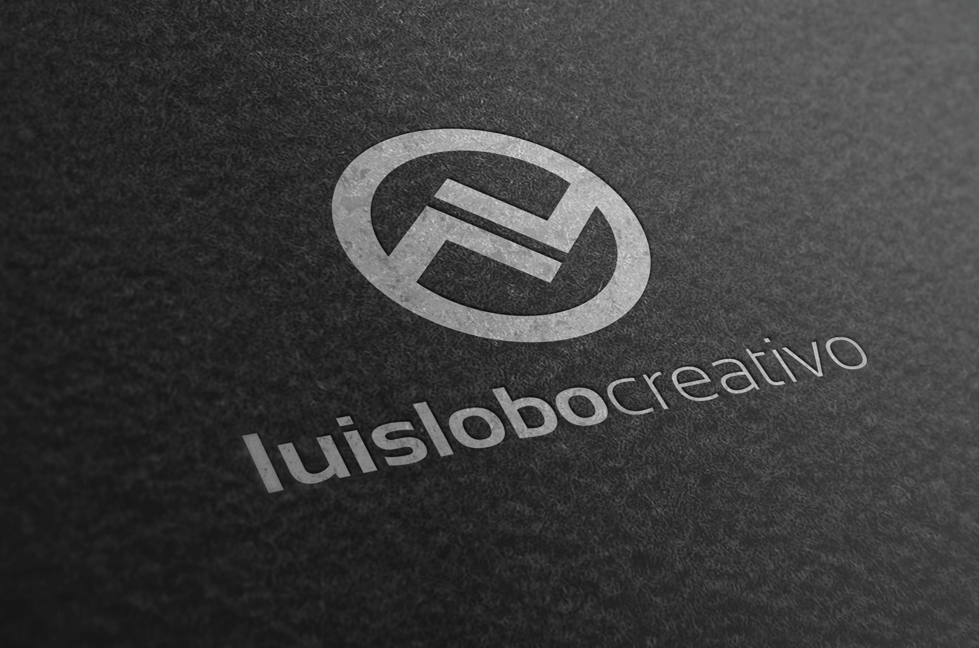
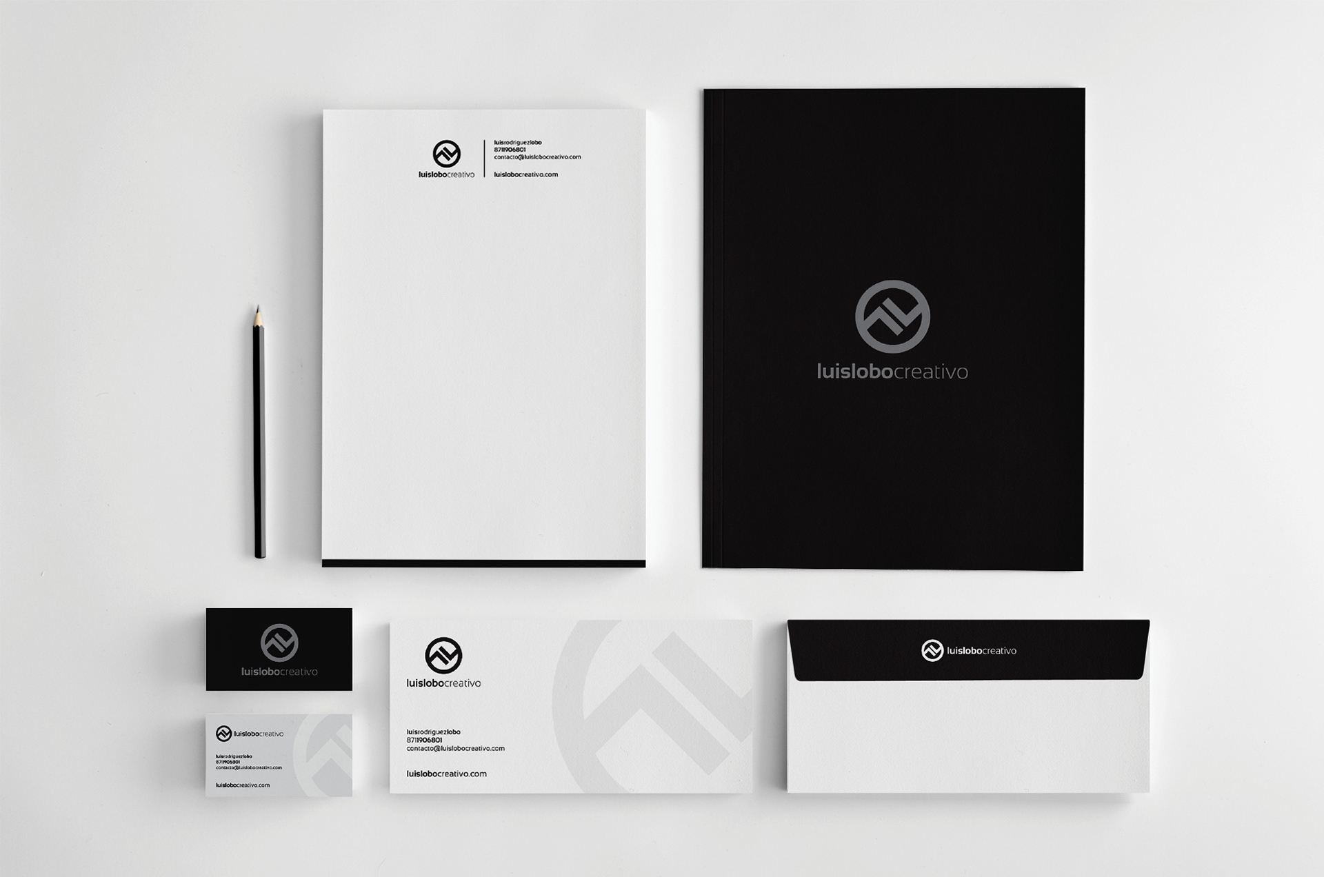
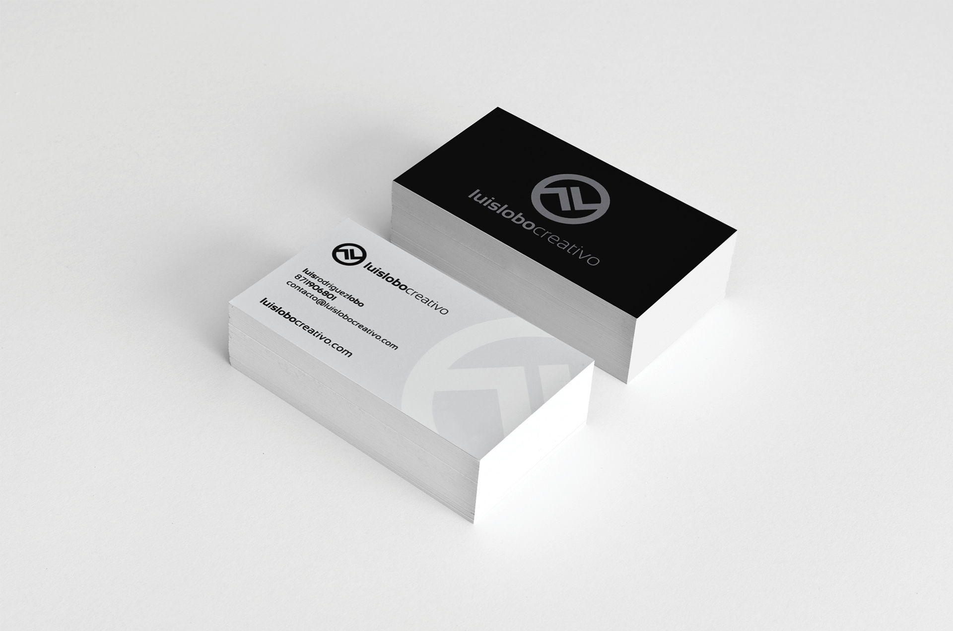
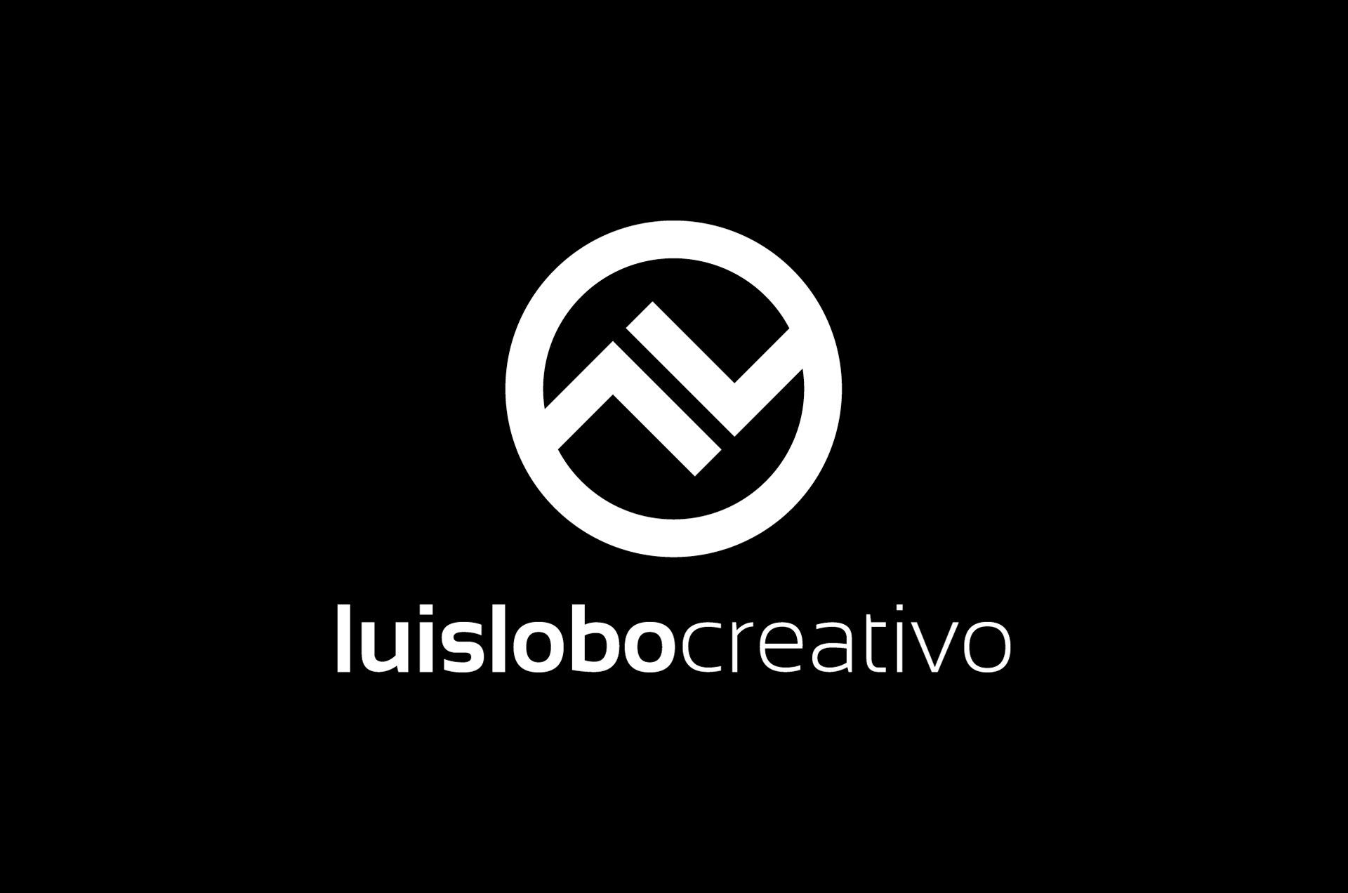
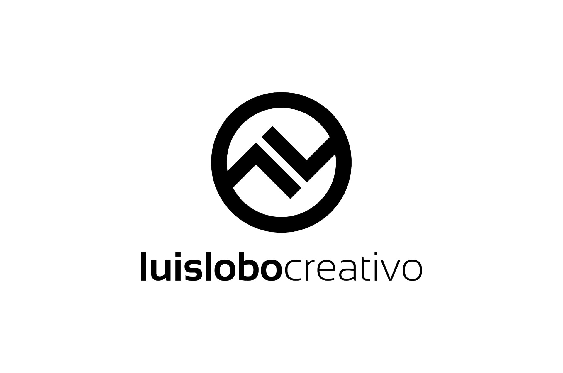
New image for my own brand. When I started to work on it I knew I wanted two things: Play with the two "L's" in my name and I wanted a simple symbol. Also no other colors than black and white, and in some cases shades of gray. The result was a design that looks well over most promotionals and surfaces. Its simple and elegant.