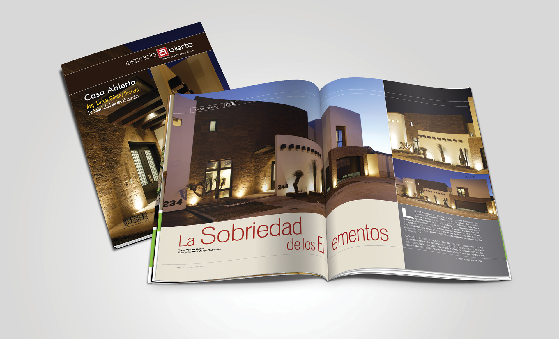
Modern, minimalist, and clean. Espacio Abierto was a project I was invited to be a part of and I functioned as the Creative Director for volumes 1 - 7. It was the first magazine in my hometown to focus on art, interior design and architecture. The magazine had a custom size, a little bit taller and wider than letter, but not as tall as legal. The reason for this is we wanted the magazine to stand out above other magazines on the shelf, in which most magazines we letter sized, so no matter where the magazine was put, it would stand above the others. It had a matte laminated finish on the cover and back cover. Some of the important sections of the magazine dealt with well-stablished and up-and-comer architects, local artists and interior design elements. A photographer specialized in architecture photography was hired for the main articles. The design is very straight forward and clean, avoiding cluttered pages and paying special attention to breathing spaces.